Strawberry Harvester.
- Role
- Product and UX design, project manager, scrum master
- Team
- 5-person senior design team, UCF
- Timeline
- May 2026 – present
- Tools
- Figma, React, TypeScript, Jira
- Sponsor
- Autonomous Robots and Controls Lab (ArcLab), UCF
The problem
The lab’s robot works. Computer vision finds the ripe berries and a robotic arm picks them.
Starting it was the problem. Before the robot picked anything, the operator had to do all of this:
- Power on the hardware.
- Launch a Python script.
- Start MATLAB.
- Install an IDE extension.
- Set the file paths.
- Answer prompts in a command window.
The lab showed the robot to farmers and got little interest. The hardware was not the obstacle. The setup was.
My job was to build an interface that lets a farmer start, check, calibrate, run and review the robot without using a command line.
Who it is for
The product has two kinds of user.
Farmers and operators have low to mixed technical literacy. The design targets operators aged 55 and up. They work outdoors, on a laptop, in glare, sometimes in work gear.
The lab’s engineers are mechanical engineers. They need enough system detail to diagnose a fault and to extend the robot.
So the interface stays simple on the surface, and shows the detail at the moment something fails.
Where the references came from
I found few good interface references for outdoor robotics. Most of them were dense and hard to read. I used music software instead.
Digital audio workstations and hardware synthesizers put many controls on one screen and stay readable at a glance. An operator in a field needs the same thing. I kept a reference library of layouts and control schemes, and used it throughout the project.
That gave me one rule. Where appearance and readability conflict, readability wins. The screen has to work in direct sun.
Flow before frames
I mapped the operator’s journey with a teammate before I designed any screens. The map showed the gaps early.
- First launch
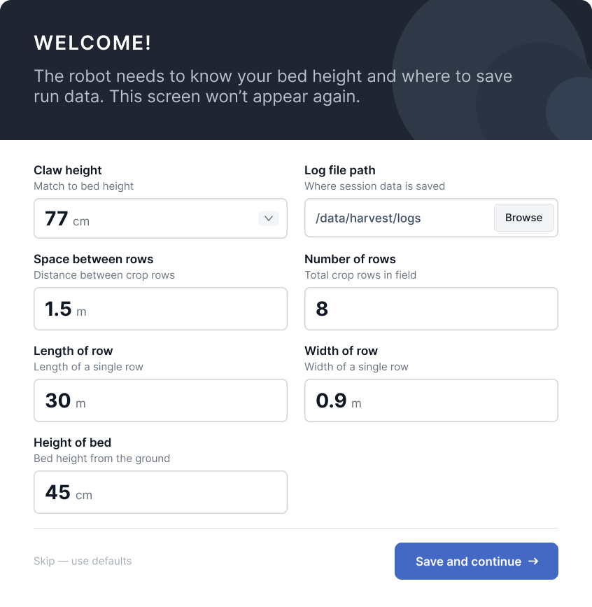
- First-time setupbed layout and defaults
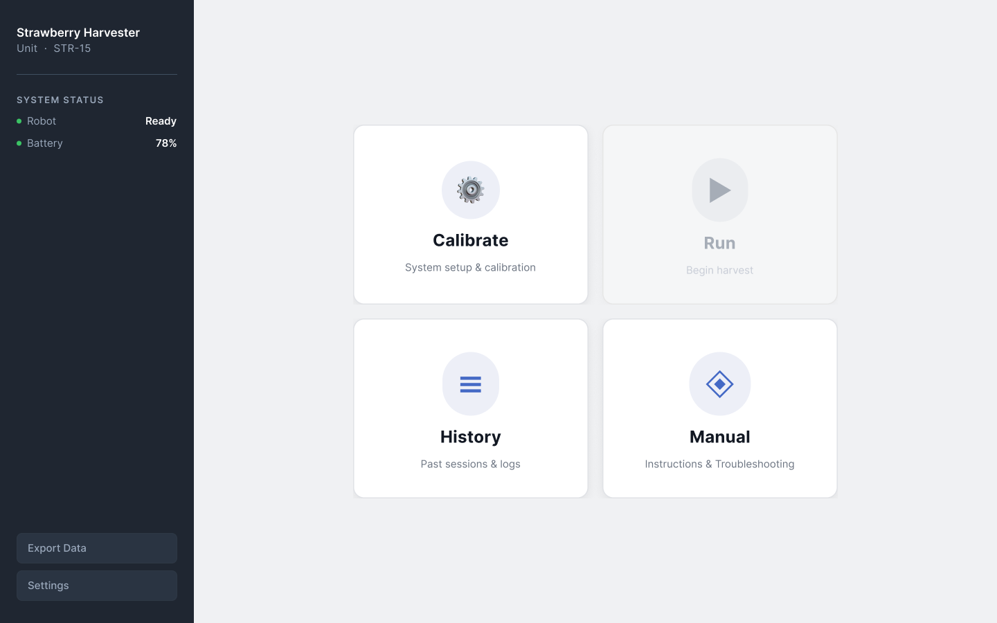
- Homethe hub. Run stays locked until the robot is ready.
- Calibrate
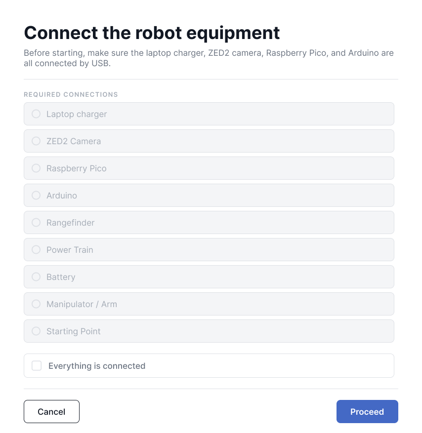
- Equipment checklist
- Power checklist
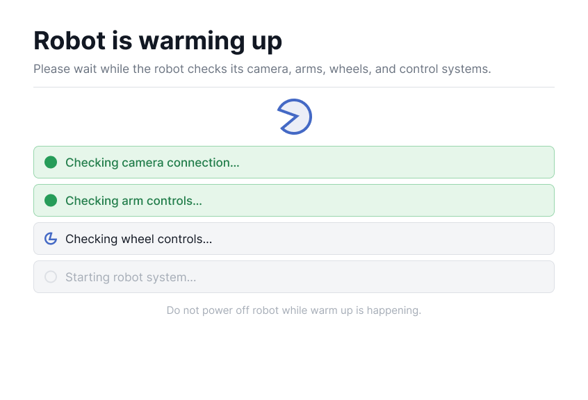
- Diagnostic warm-up
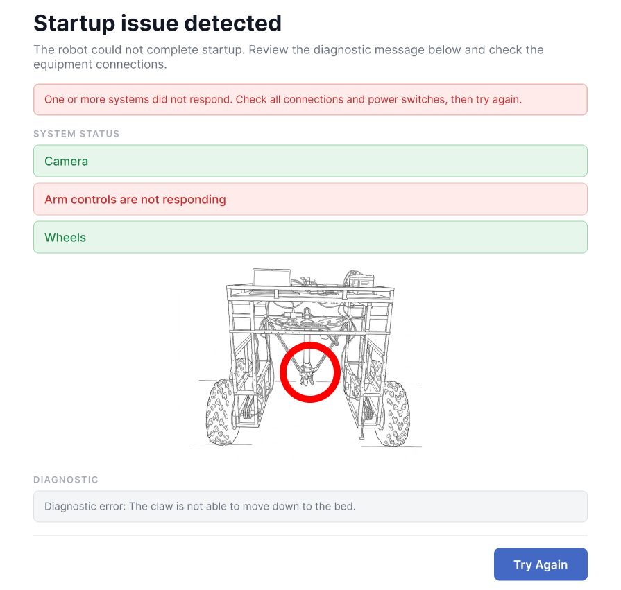
- Issue found Startup issue fix Try againreturns to the warm-up check
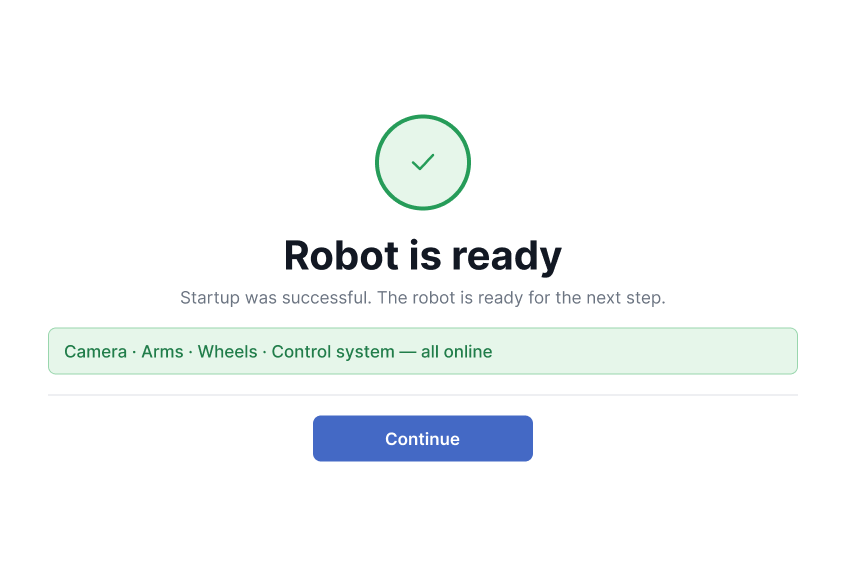
- All clear Robot ready
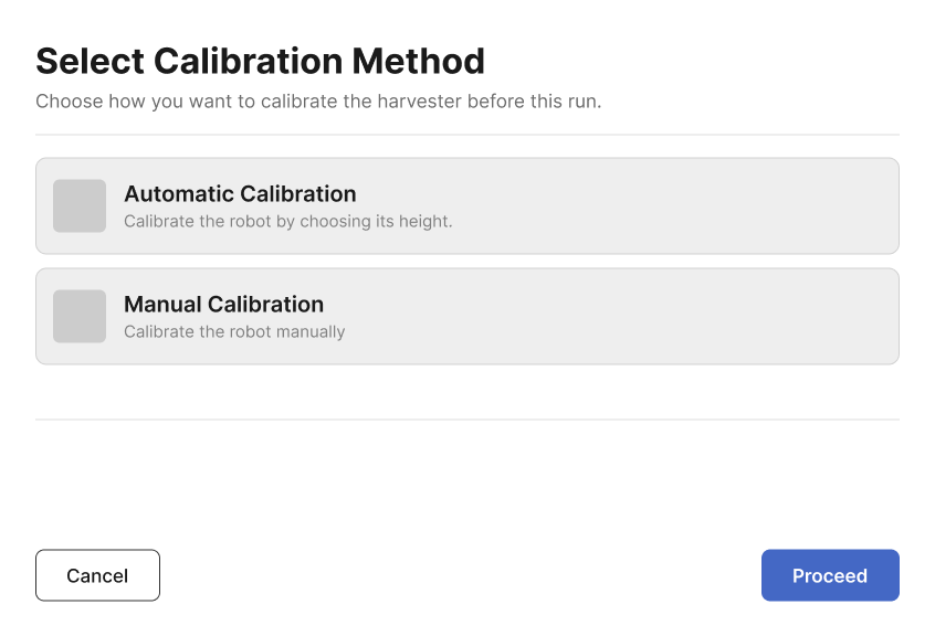
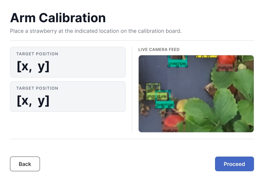
- Choose calibrationautomatic by robot height, or manual arm calibration
- Checking calibration
- Calibration completereturns Home, and Run unlocks
- Run
- Runtime statisticsmap or camera view, with an emergency stop
- Stopautomatic on a full basket, low battery or fault, or manual
- Run completesummary, then Home
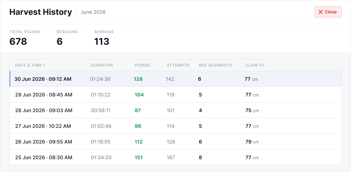
- Historypast sessions, export data
- Manualthe built-in user manual
- Settings
- Calibrate
- One hub. Every path starts at Home and returns to it.
- Run stays locked. It is greyed out until the robot passes diagnostics and is calibrated, so the operator cannot start a harvest in the wrong order.
- Errors name three things. The system that failed, where it sits on the robot, and the next action. The operator never sees a fault code.
- Each run ends in a summary. The summary has a route back to Home.
Key screens
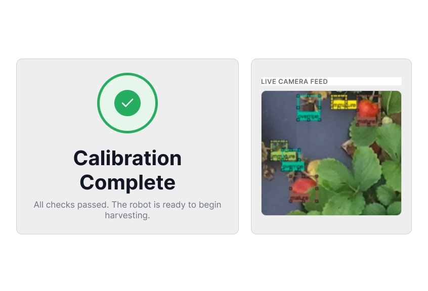
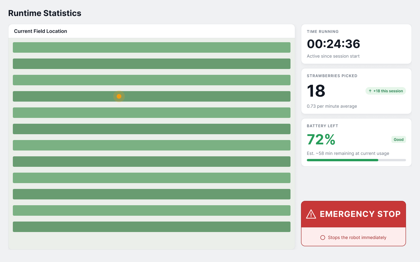
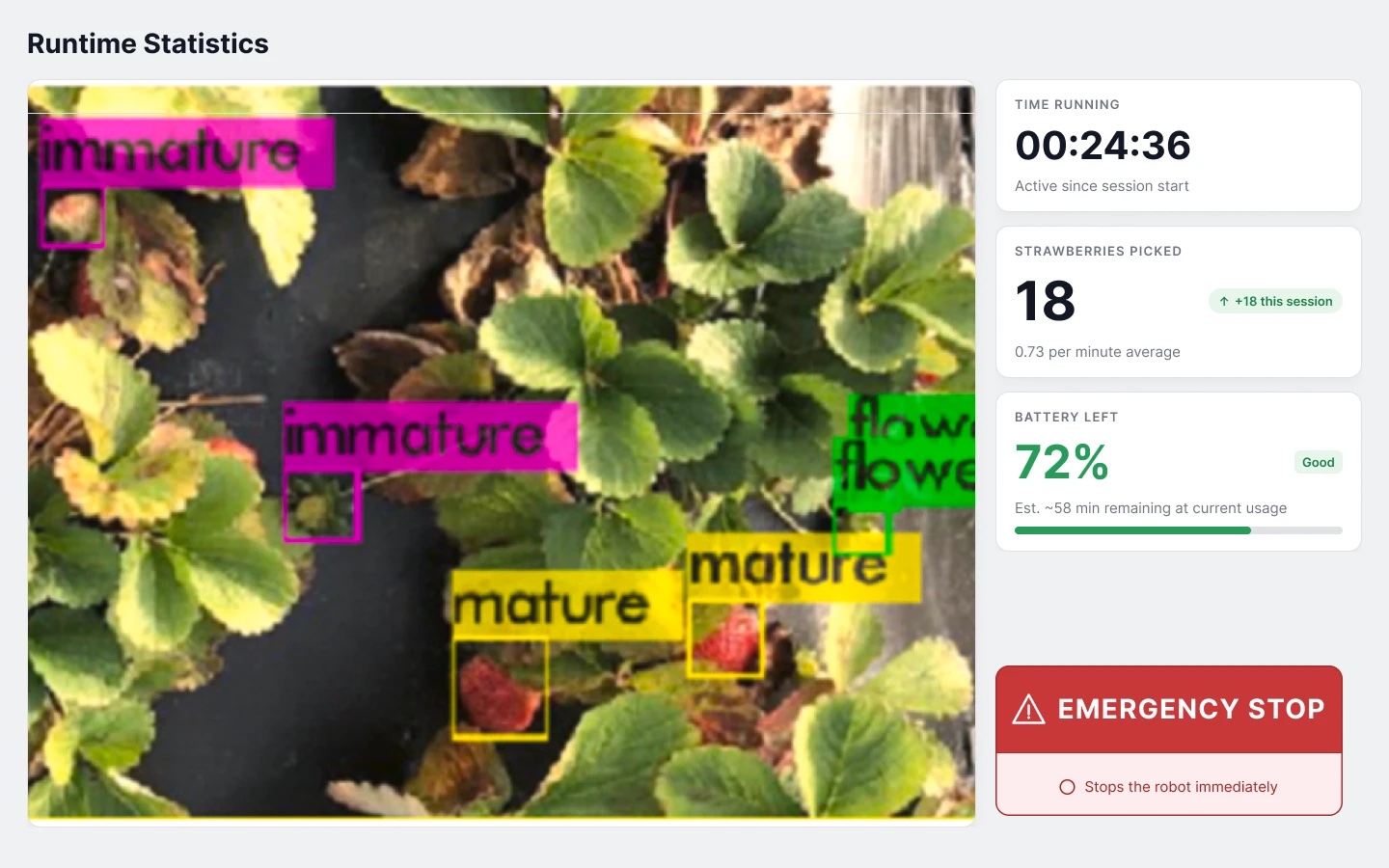
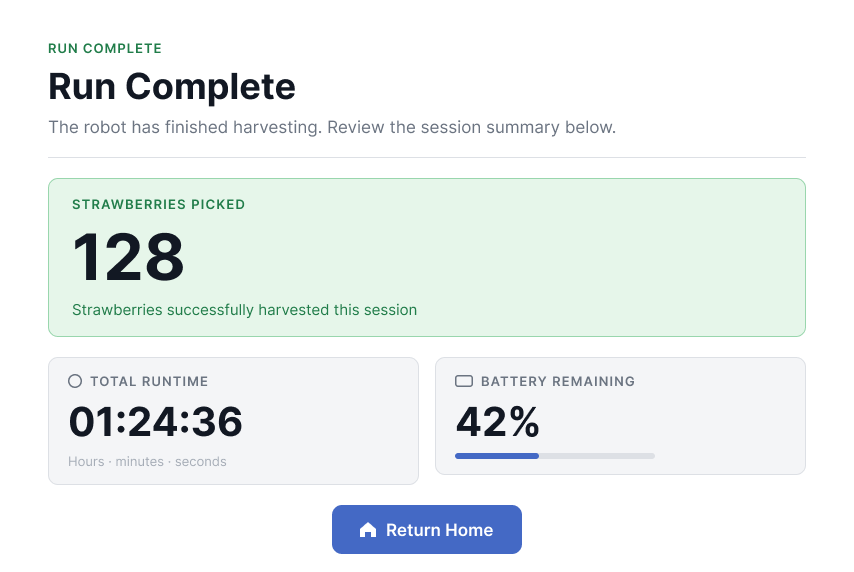
Iterating with the sponsor
I demoed the prototype to the lab’s director and asked for feedback on layout, type, colour, flow, and missing information. That feedback reshaped the product.
- Bigger type. Operators may have eyesight issues, and summer glare makes small text harder to read.
- Boot-up and calibration merged. Calibration moved into the startup sequence instead of running after Run is pressed, so pressing Run now starts harvesting immediately. That is why the first card on Home is Calibrate.
- More setup detail and safety checks. Extra field settings, more pre-boot checks, and an alert when the strawberry basket is full.
- Pop-ups became full-screen steps. Boot-up and calibration started as modals. Full-screen made them larger and easier to follow one step at a time.
One system, not per-screen decisions
I made these decisions once, for the whole interface, so no screen invents its own version.
- Canvas. 1440×900, matching the field laptop. Early modals shared one fixed footprint so they never jumped around.
- Type. Inter only, in four weights, with large display sizes for the numbers that must read from a distance.
- Colour. Green means healthy or ready. Blue means the control does something. Red is only for failure and the emergency stop. No colour does two jobs, which matters in a flow full of yes or no branches.
- Shape and spacing. Mostly sharp corners for an equipment-grade feel, pills only for status chips, and a 4px spacing grid to keep dense screens orderly.
Design to code
I built the interface in Figma as reusable components. I named the frames in PascalCase to match their React components, so the engineers could build from them directly.
My role
I held three roles. As project manager I was the main sponsor contact, and turned a broad brief into scoped problems. As scrum master I built the team’s Jira workflow, then rebuilt it with the team after the first version confused everyone. As designer I owned the user flow, the interface and the design system.
What is next
The interface has not been field-tested with farmers yet, so there are no outcome numbers to report here.
- Tighten the type scale into a strict set of named sizes. A few one-off sizes crept in during fast iteration.
- Consolidate the green shades into fewer named tokens.
- Test with farmers in the field, and measure setup time and errors against the old command-line process.
Figma, React, TypeScript and Jira. Senior design project at UCF, sponsored by the Autonomous Robots and Controls Lab.